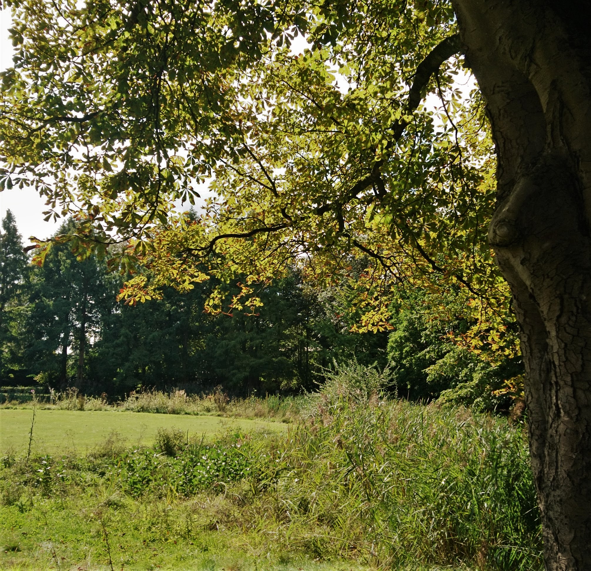
Let’s welcome fall
As the leaves are changing colors the cool wind sweeps them off their branches and into the air. As a child I always loved seeing a cloud of leaves playing in the wind. Even as of today I feel like a child again when I see that phenomenon again.
The colors of the leaves always bring me joy and good memories. That’s exactly why I wanted to give fall a warm welcome into our world. What better way than to dedicate an art piece to it.
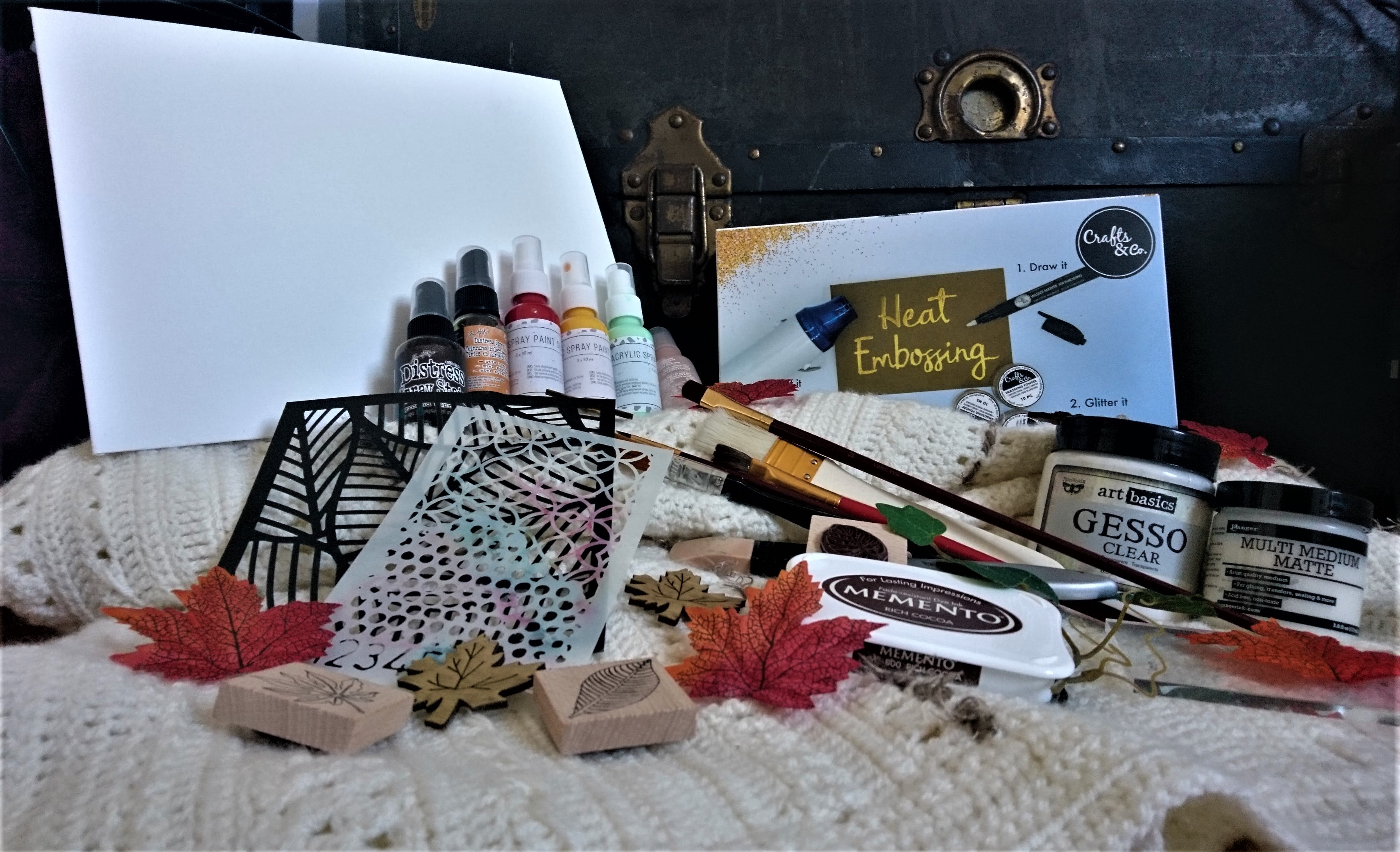
Let’s start with some ingredients to this mixed media art piece. Here is an overview picture to show the items that were used in the process.
Let’s go over the process of creating Fall’s welcome gift. In four general steps I created texture and color which portray the idea of wind sweeping the leaves around in a playful matter, while the sun is slowly setting in the background.
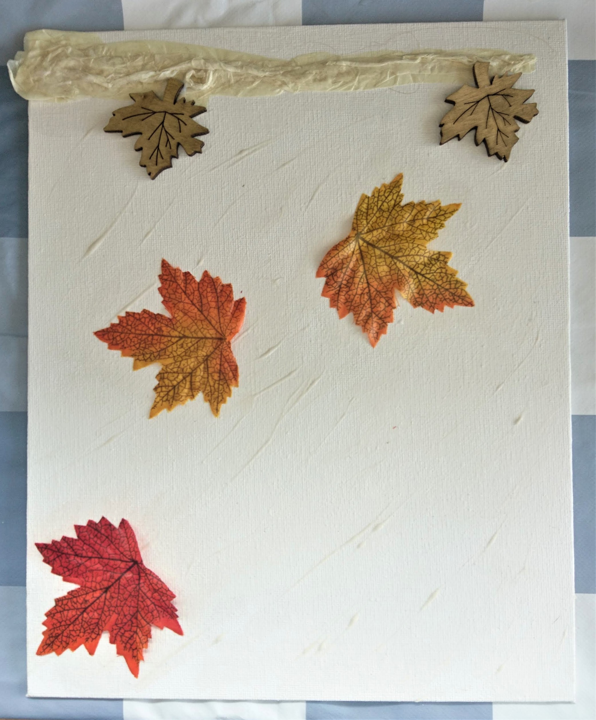
The first step was to create a texture. For this I used the leaves themselves, but also a mixture of gesso, multi medium matte and scrap paper. The scrap paper was used to mimic the branch on which the leaves used to live. The gesso was put on in a sweeping matter to emulate the wind blowing.
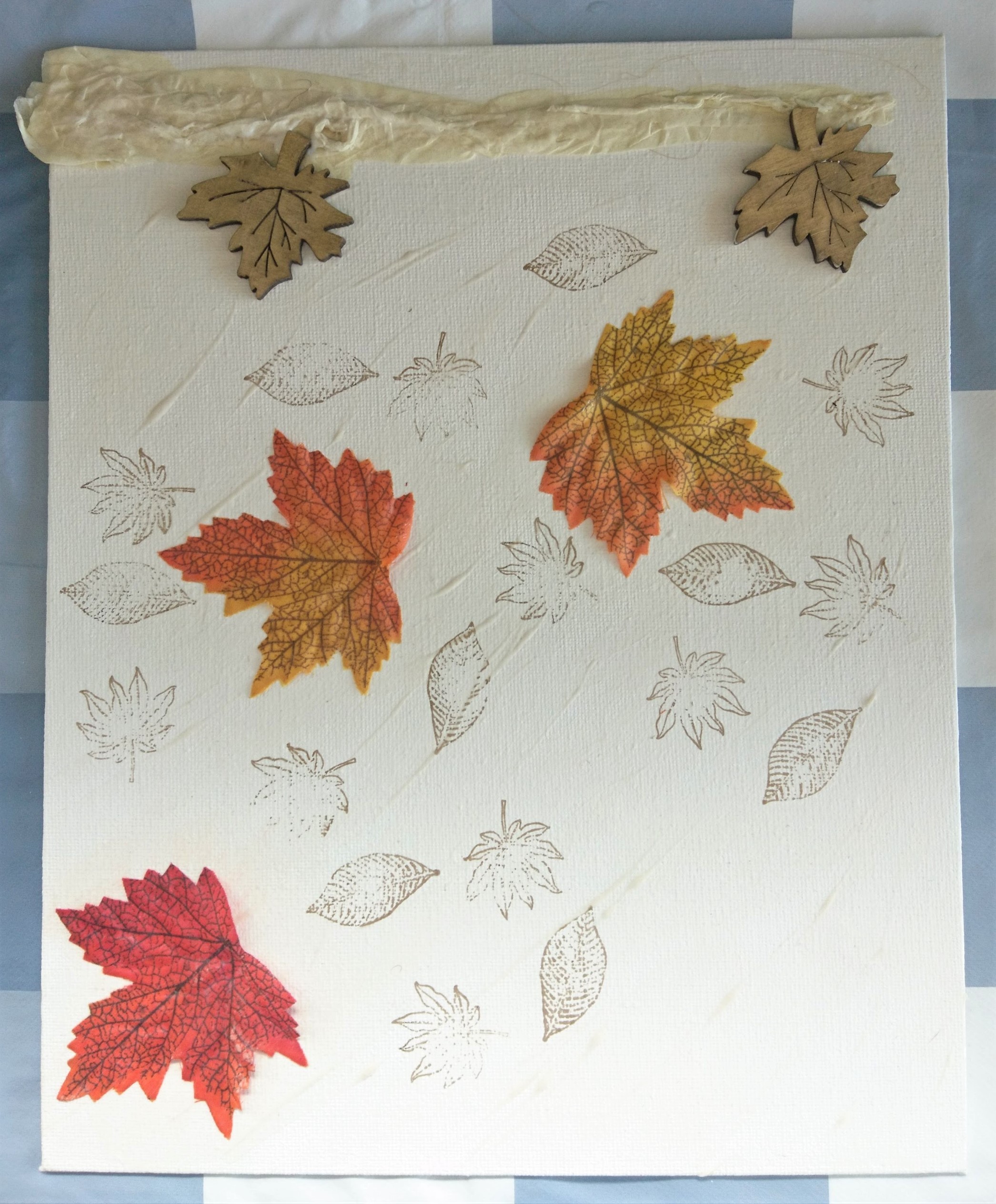
The second step I added some interest in the background. Even though it might not be a prominent eye catcher, it will give our playful leaves some depth. I used some leave stamps and waterproof ink to make sure the paints that we will use do not interact with the background.
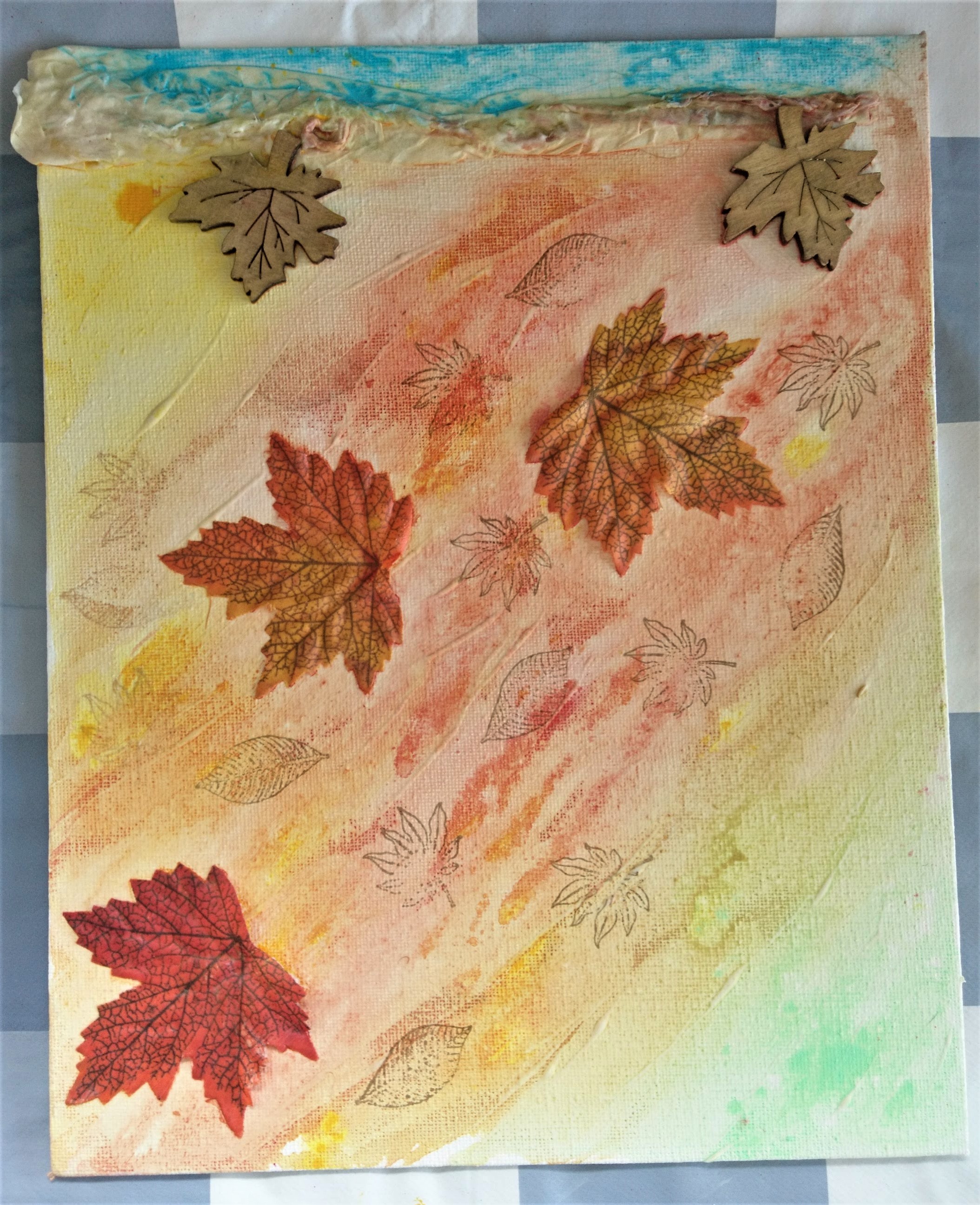
In the third stage I began to add some color. I made sure to let the colors make sense, because I wanted to portray my memory from childhood. I used Acrylic sprays and water to make them blend. I let the colors run in the direction my wind is going to deepen the sense of movement.
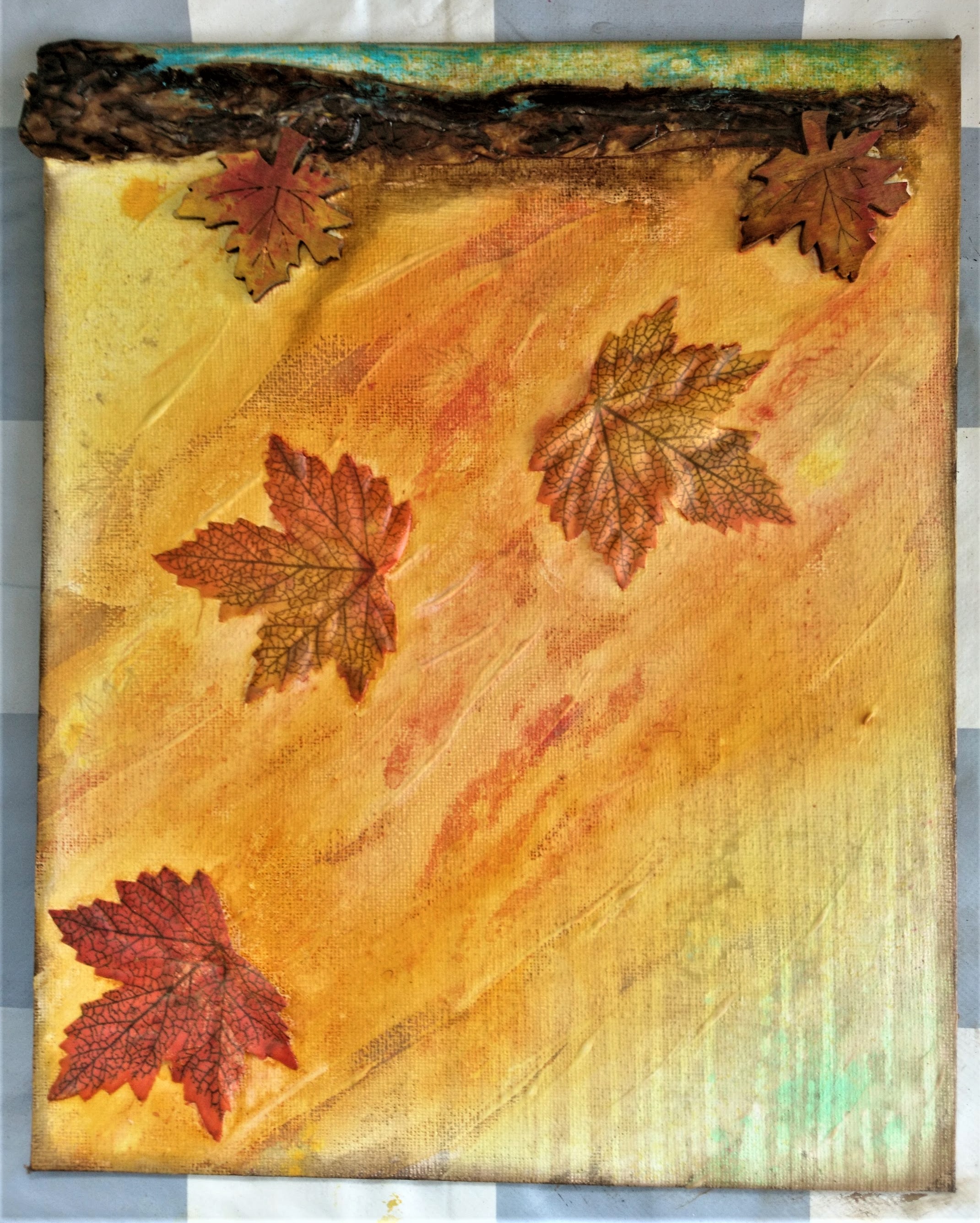
In the fourth stage I added distress ink sprays to make the colors look stronger. I like this technique a lot, because the inks are very transparent and let’s the background peek through.
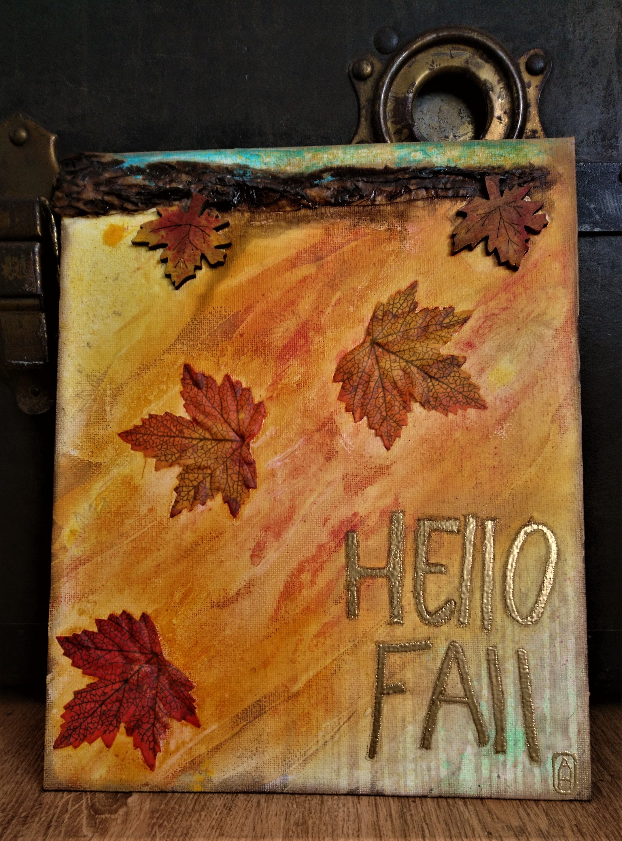
As a finishing touch I tried my hand at heat embossing the title of the piece on the bottom right corner. I didn’t do too bad if I may say so myself. To make the embossing stand out a little more I added some shadow around the letters to make the pop a little more. And voila you have a beautiful piece dedicated to fall.
2 Comments
Carin
Weer gezellig stukje
Ik hou van de herfst????
?
afpheijboer
Dankje! De herft is dan ook een heel mooi seizoen